Calculating Effective Recruiting Populations
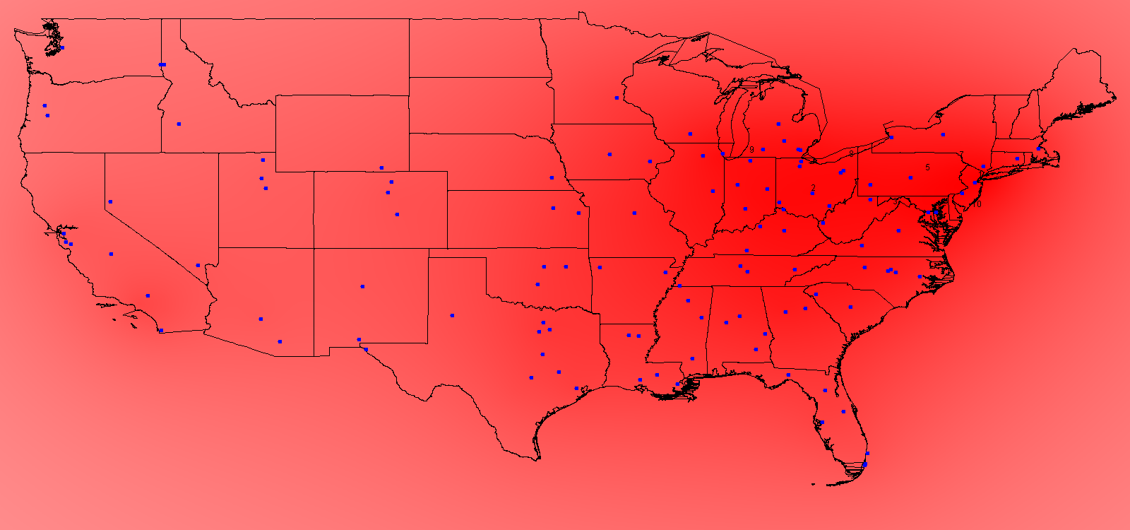
The "effective" population at any location is not dictated merely by the people living AT that location, but by those living nearby. "Nearby" is a relative term--that is, with respect to recruiting high school athletes, how likely is a school in, say, upstate New York to successfully recruit an athlete from Buffalo versus one from Los Angeles? We can imagine a population centered at Los Angeles as being representated by some sort of decay curve, that is when I add LA to my map, the effective population at LA is ~9 million, maybe ~6 million by the time I've moved east into Arizona, and maybe 1 million by the time I get to Houston.
Therefore, once we find a way to model this decay with a continuous function, when we read in a population at some point on the map, I can calculate that source's effective population at every point on the map. By incrementing at every point on the map for every point source of population we arrive at an effective population at each location.
The other question is how do we assess the competing influences of the other schools? A college may have access to a big population 50 miles to the north but there may already be three other schools drawing recruits from the same area.
To address the first question, we must come up with some sort of decay function to scale the population at various distances from its source. For instance we can write an equation of the sort:
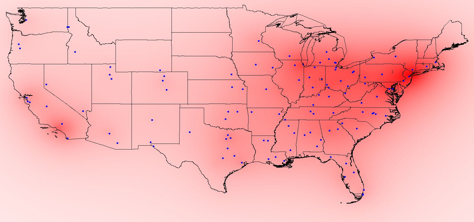
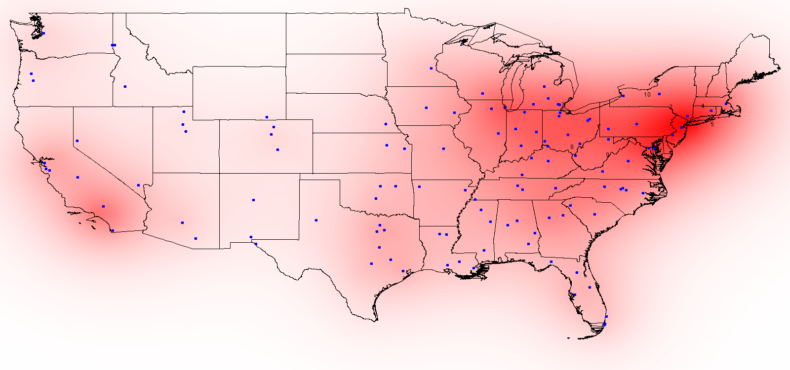
This equation can be easily tweaked. Miles might result in too sharp of a decline (i.e. the effective populaiton is probably not 1/3000th as high 3000 miles away) so we could divide the total miles into, say, 200 miles (so in the example above being 3000 miles away would result in an effective population of 1/15th as at the source). The other simple tweak is to change the order, i.e. from Distance to Distance Squared (or cubed or to the fourth power, etc.). An exponential decay could also be used. A variety of these types of scaling are shown at the bottom of the page (using the US 2000 Census for the population sources).
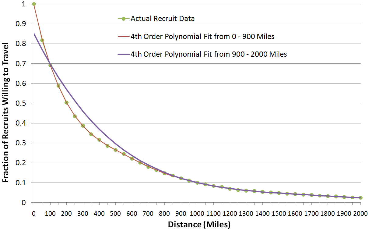
A more complicated (but much more rigorous) method, and the method which is used for most of the fits on this site, is to see how recruits actually behave. This was done by taking the rosters of the 120 Division I-A (FBS) teams and calculating how far away each player's home town is from the school. This process was not nearly as painstaking as it could have been as I made use of some data from the 2000 Census which includes the latitude and longitude of more/less every city in the US. My lookup script unfortuntely didn't locate every player but more than 90% of them (e.g. when a player's hometown is called by a different name on the official roster or is missing. The distribution of "unfound" players was arbitrary and disregarded. This reduced the population from 13040 to 12070, a drop of ~7.5%). Some interesting stats appear simply by looking at this data: ~18% of players' schools are within 50 miles of their hometown, about 50% within 200 miles, and 90% within 1000 miles.
This data is also interesting because of the ways it can be interpreted. Knowing that 20% of players move more than 50 miles for college, we can consider that 80% of recruits are willing to travel 50 miles for college, so the effective recruiting population 50 miles from a point source (i.e. city) is 0.80 * the population AT the point source. Breaking up the data into 50 mile increments like this I was able to generate sufficient data points to find a curve to approximate the data. For players within 900 miles, their "willingnes" was fit (e.g. using a program like Matlab or Octave) by a 4th Order Polynomial with the equation:
For locations 900 - 2000 miles away from a source I used a 4th order polynomial (previously a 5th order fit, but the 4th order one is just as good) (note: for distances greater than 2000 miles I used 2000; I don't think this impacts the data much as you're dealing with pretty small numbers of recruits (~97.5% are within 2000 miles)). Incidentally this equation actually provides a better fit from 850 miles and up (hence it was used for population sources 850 or more miles away):
So what do these equations mean? Does it matter that they are "fourth order" or "fifth order"? No, they merely enable us to use a continuous equation to calculate the scaling factor (between 0 and 1) for any distance from a source to any other spot on the map. The recruit data with the two fits is shown below (note the fit from 900 - 2000 miles should not and does not fit the data well at short distances):
The other issue, which is perhaps the most difficult problem to quantify, is how to factor in the competing influences of other schools. The simplest method is to consider each school as being an equal "recruit sink", in other words we can call it a "negative population source". Each college then has an equal share of the total population, if you have 12,000 athletes, each of the 120 schools has a share of 100 of them, therefore each college will be read in as a point source of -100.
While simple, this equality assumption is not very realistic; e.g. many recruits when given the chance between Kent State and Ohio State will opt for the latter. A few quantifiable criteria can be used then to scale the competing influence of such schools, "prestige factors" if you will, e.g. whether or not they play in a "Big 6" conference, their winning percentage over the last decade, total number of program wins, et cetera.